
Though this book is supposed to be a description of the graphics infrastructure a statistical system could provide, you can and should also see it as a (huge, colourful) book of statistical plot examples.
The author suggests to describe a statistical plot in several consecutive steps: data, transformation, scale, coordinates, elements, guides, display. The "data" part performs the actual statistical computations -- it has to be part of the graphics pipeline if you want to be able to interactively control those computations, say, with a slider widget. The transformation, scale and coordinate steps, which I personnally view as a single step, is where most of the imagination of the plot designer operates: you can naively plot the data in cartesian coordinates, but you can also transform it in endless ways, some of which will shed light on your data (more examples below). The elements are what is actually plotted (points, lignes, but also shapes). The guides are the axes, legends and other elements that help read the plot -- for instance, you may have more than two axes, or plot a priori meaningful lines (say, the first bissectrix), or complement the title with a picture (a "thumbnail"). The last step, the display, actually produces the picture, but should also provide interactivity (brushing, drill down, zooming, linking, and changes in the various parameters used in the previous steps).
In the course of the book, the author introduces many notions linked to actual statistical practice but too often rejected as being IT problems, such as data mining, KDD (Knowledge Discovery in Databases); OLAP, ROLAP, MOLAP, data cube, drill-down, drill-up; data streams; object-oriented design; design patterns (dynamic plots are a straightforward example of the "observer pattern"); eXtreme Programming (XP); Geographical Information Systems (GIS); XML; perception (e.g., you will learn that people do not judge quantities and relationships in the same way after a glance and after lengthy considerations), etc. -- but they are only superficially touched upon, just enough to wet your apetite.
If you only remember a couple of the topics developped in the book, these should be: the use of non-cartesian coordinates and, more generally, data transformations; scagnostics; data patterns, i.e., the meaningful reordering of variables and/or observations.
Here are now a "few" examples, mainly focusing on the transformation-scale-coordinate step. Of course, all the plots were done with R.
The simplest series of examples, that serves as an introduction to the book, is the remark that the much decried pie chart (it is very difficult for us humans to compare areas or angles) is nothing more that a barchart in polar coordinates.
op <- par(mfrow=c(2,2), mar=c(2,4,2,2))

# Barchart (1 bar)
set.seed(1)
x <- rlnorm(6)
barplot(as.matrix(x),
        xlim = c(-2,3),
        main = "Barchart")

# Barchart with an added dimension (stacked area chart) (p.173)
y <- matrix(rnorm(60), nc=6)
y <- apply(y, 2, cumsum)
y <- exp(y/5)
stacked_area_chart <- function (y, axes = TRUE, ...) {
  stopifnot(all(y>=0))
  y <- t(apply(y, 1, cumsum))
  plot.new()
  plot.window(xlim = c(1,nrow(y)),
              ylim = range(y) + .1*c(-1,1)*diff(range(y)))
  for (i in ncol(y):1) {
    polygon(c(1,1:nrow(y),nrow(y)),
            c(0,y[,i],0),
            col=i, border=NA)
    lines(1:nrow(y), y[,i], lwd=3)
  }
  if (axes) {
    axis(1)
    axis(2)
  }
  box()
}
stacked_area_chart(y, axes = FALSE)
title(main = "Barchart with an added dimension",
      sub = "Stacked area chart")

# Pie chart
pie(x,
    col = 1:length(x),
    labels = LETTERS[1:length(x)],
    main = "Pie chart")

# Annular chart
annular_chart <- function (x, r1=1, r2=2) {
  stopifnot(x>=0, r1 >= 0, r2 > 0, r1 < r2)
  x <- cumsum(x) / sum(x)
  x <- c(0,x)
  plot.new()
  plot.window(xlim = c(-1.1,1.1)*r2,
              ylim = c(-1.1,1.1)*r2)
  for (i in 2:length(x)) {
    theta <- 2*pi*seq(x[i-1], x[i], length=100)
    polygon( c(r1 * cos(theta), r2 * cos(rev(theta))),
             c(r1 * sin(theta), r2 * sin(rev(theta))),
             col = i )
  }
}
annular_chart(x)
title("Annular chart")

par(op)
op <- par(mfrow=c(1,2))

# Pie chart
pie(x,
    col = 1:length(x),
    labels = LETTERS[1:length(x)],
    main = "From bad...")

# Concentrical chart p. 208
# Grid graphics would be better for this: they would
# help you enforce orthonormal coordinates, and thus
# circular circles...
circular_pie <- function (x, ...) {
  stopifnot(is.vector(x),
            all(x >= 0),
            length(x) >= 1)
  plot.new()
  radii <- sqrt(cumsum(x)) # The areas are
                           # proportional to the
                           # inital x
  plot.window(xlim = max(radii)*c(-1.1,1.1),
              ylim = max(radii)*c(-1.1,1.1) )
  theta <- seq(0, 2*pi, length=100)[-1]
  x <- cos(theta)
  y <- sin(theta)
  for (i in length(x):1) {
    polygon(radii[i] * x, radii[i] * y,
            col = i, border = NA)
    lines(radii[i] * x, radii[i] * y)
  }
}
circular_pie(x)
title("...to worse")
par(op)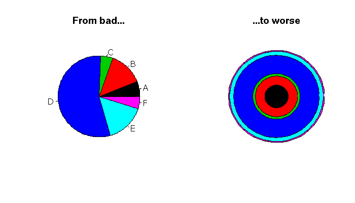
op <- par(mfrow=c(1,2))

# barchart (several bars) p. 211
xx <- sample(x)
barplot(cbind("1" = x, "2" = xx),
        space = 1,
        xlim = c(0,5),
        col = 1:length(x),
        main = "Barchart with several bars")

# Several annular charts p.212
annular_chart_ <- function (x, r1=1, r2=2) {
  stopifnot(x>=0, r1 >= 0, r2 > 0, r1 < r2)
  x <- cumsum(x) / sum(x)
  x <- c(0,x)
  for (i in 2:length(x)) {
    theta <- 2*pi*seq(x[i-1], x[i], length=100)
    polygon( c(r1 * cos(theta), r2 * cos(rev(theta))),
             c(r1 * sin(theta), r2 * sin(rev(theta))),
             col = i )
  }
}
two_annular_charts <- function (x, y,
                               r1=1, r2=1.9,
                               r3=2, r4=2.9) {
  plot.new()
  plot.window(xlim = c(-1.1,1.1)*r4,
              ylim = c(-1.1,1.1)*r4)
  annular_chart_(x, r1, r2)
  annular_chart_(y, r3, r4)
}
two_annular_charts(x, xx)
title("Two annular charts")

par(op)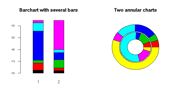
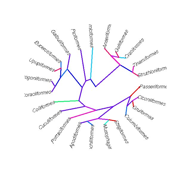
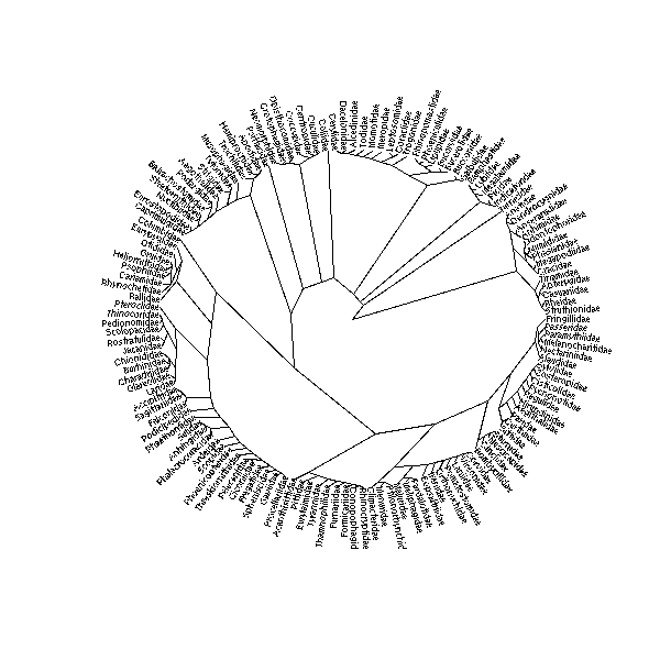
Other plots can also be drawn in polar coordinates: for instance, a cluster tree.
library(ape)
example(plot.ancestral)
example(plot.phylo)
Polar coordinates can also highlight the periodicity of some data sets.
# Polar plot to spot seasonal patterns
x <- as.vector(UKgas)
n <- length(x)
theta <- seq(0, by=2*pi/4, length=n)
plot(x * cos(theta), x * sin(theta),
     type = "l",
     xlab = "", ylab = "",
     main = "UK gas consumption")
abline(h=0, v=0, col="grey")
abline(0, 1, col="grey")
abline(0, -1, col="grey")
circle <- function (x, y, r, N=100, ...) {
  theta <- seq(0, 2*pi, length=N+1)
  lines(x + r * cos(theta), y + r * sin(theta), ...)
}
circle(0,0, 250, col="grey")
circle(0,0, 500, col="grey")
circle(0,0, 750, col="grey")
circle(0,0, 1000, col="grey")
circle(0,0, 1250, col="grey")
segments( x[-n] * cos(theta[-n]),
          x[-n] * sin(theta[-n]),
          x[-1] * cos(theta[-1]),
          x[-1] * sin(theta[-1]),
          col = terrain.colors(length(x)),
          lwd = 3)
text(par("usr")[2], 0, "Winter", adj=c(1,0))
text(0, par("usr")[4], "Spring", adj=c(0,1))
text(par("usr")[1], 0, "Summer", adj=c(0,0))
text(0, par("usr")[3], "Autumn", adj=c(0,0))
legend("topright", legend = c(1960, 1973, 1986),
       fill = terrain.colors(3))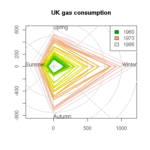
Another simple transformation is the logarithm: just take the logarithm on one or both axes. This is helpful when the variable on this axis has a log-normal distribution or, more generally, is "closer" to the log-normal distribution than to the gaussian one (positive, skewed, fat right tail).
x <- read.csv("2006-08-27_pe.csv")
op <- par(mfrow=c(1,2))
plot(p ~ eps, data=x, main="Before")
plot(log(p) ~ log(eps), data=x, main="After")
par(op)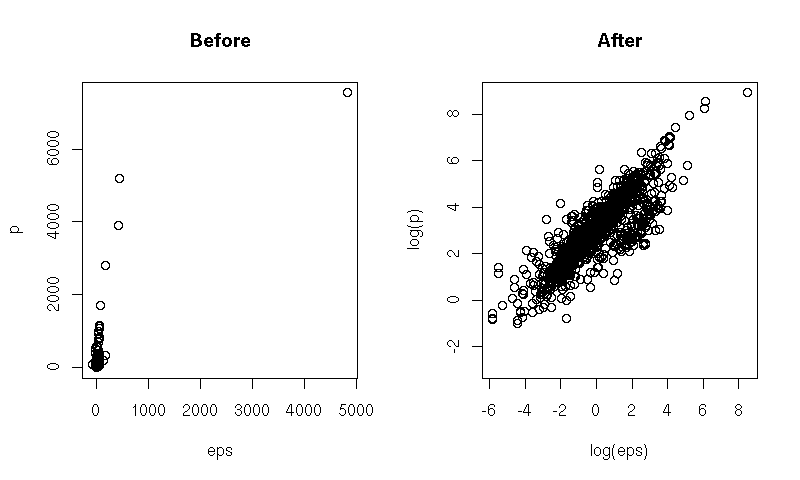
In some situations, other transformations are meaningful: power scales, arcsine, logit, probit, Fisher -- see the book for (scarce) details.
The quantile-quantile plot, i.e., the plot of the quantiles of a sample of the variable you are studying and those of a reference variable (usually, a gaussian distribution, but you can take anything else), is actually an example of those scales.
# Stock monthly returns
library(fSeries)
data(black.ts)
y <- as.matrix(black.ts[,-1])
op <- par(mfrow=c(1,2))
# Are they gaussian?
qqnorm(y,
       main = "Monthly stock returns are not gaussian",
       cex.main = 1)
qqline(y, col="red", lwd=3)
# Are they T(df=4)?
y <- sort(y)
n <- length(y)
x <- qt(ppoints(n), df=4)
plot(x, y,
     xlab = "Theoretical quantiles",
     ylab = "Sample quantiles",
     main = "but rather T with 4 degrees of freedom",
     cex.main = 1)
yy <- quantile(y[!is.na(y)], c(0.25, 0.75))
xx <- quantile(x[!is.na(x)], c(0.25, 0.75))
slope <- diff(yy)/diff(xx)
intercept <- yy[1] - slope * xx[1]
abline(intercept, slope, lwd=3, col="red")
par(op)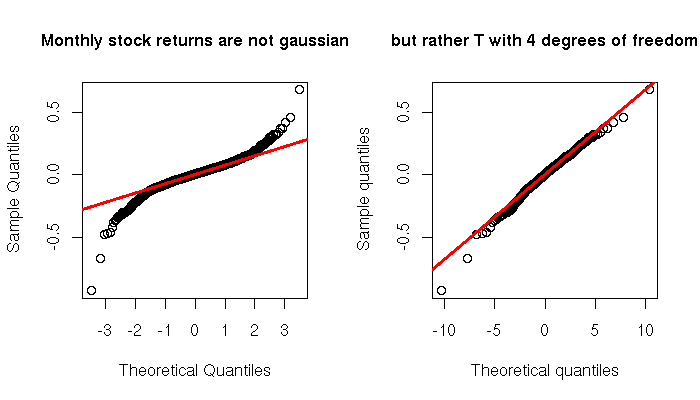
When plotting time series, the time variable given by the actual, clock-on-the-wall time is not always the best way of viewing your data. If the phenomenon studied goes faster at some times of the day and slower at others, a time distortion according to this pace might be helpful. This is the case with financial data: we can plot intraday prices with respect to clock time or market time (defined, e.g., with the number of transactions or the cumulated volume of those transactions).
two_time_scales <- function (x1, x2, y) {
  stopifnot( length(x1) == length(y),
             length(x2) == length(y),
             x1 == sort(x1),
             x2 == sort(x2) )
  op <- par(mfrow=c(2,1))
  plot(x1, y, type="l", xlab="", axes=FALSE)
  box()
  axis(2, lwd=2)
  mtext(side=1, "x1", line=2.5, col="blue", font=2)
  mtext(side=3, "x2", line=2.5, col="red", font=2)
  x2lab <- pretty(x2, 10)
  axis(1, col="blue", lwd=2)
  axis(3, at = approx(x2, x1, x2lab)$y, labels=x2lab,
       col="red", lwd=2)
  plot(x2, y, type="l", axes=FALSE,
       xlab="")
  box()
  mtext(side=1, "x1", line=2.5, col="blue", font=2)
  mtext(side=3, "x2", line=2.5, col="red", font=2)
  x1lab <- pretty(x1, 10)
  axis(1, at = approx(x1,x2,x1lab)$y, labels=x1lab,
       col="blue", lwd=2)
  axis(2, lwd=2)
  axis(3, col="red", lwd=2)
  par(op)
}
N <- 100
x1 <- seq(0, 2, length=N)
x2 <- x1^2
y <- x2
two_time_scales(x1,x2,y)


x <- read.csv(gzfile("2006-08-27_tick_data.csv.gz"))
op <- par(mfrow=c(3,1))
x$DateTime <- as.POSIXct(paste(as.character(x$Date),
                               as.character(x$Time)))
x <- x[!is.na(x$TradePrice),]
plot(TradePrice ~ DateTime,
     data = x,
     type = "l",
     xlab = "Clock time",
     main = "Is time a good choice for the X axis?")
plot(x$TradePrice,
     type = "l",
     ylab = "TradePrice",
     xlab = "Transaction time")
coalesce <- function (x,y) ifelse(!is.na(x),x,y)
plot(cumsum(coalesce(x$TradeSize,0)),
     x$TradePrice,
     type = "l",
     xlab = "Volume time",
     ylab = "TradePrice")
par(op)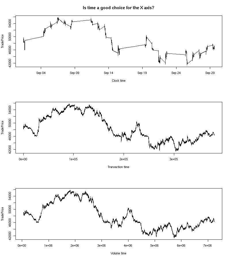
two_time_scales(
  cumsum(coalesce(x$TradeSize,0)),
  as.numeric(x$DateTime - x$DateTime[1]) / 3600,
  x$TradePrice
)
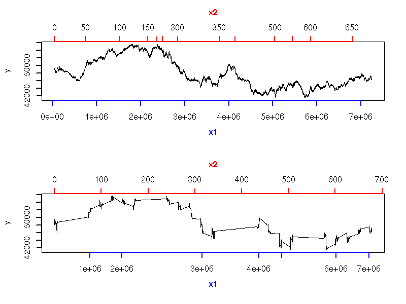
This is especially useful when comparing two time series that should follow the same pattern, but one goes faster than the other or there is a (varying) delay between the two (this idea emerged in speech recognition problems). "Dynamic Time Warping" (DTW) refers to the algorithms used to automatically map the time of one time series to that of the other -- they were initially used in spech recognition.
http://www.cs.ucr.edu/~eamonn/
The following example is similar, but the second time is derived from the data: we want the absolute value of the slope of the curve (i.e., the amplitude of the variations) to be always the same.
data_driven_time_warp <- function (y) {
  cbind(
    x = cumsum(c(0, abs(diff(y)))),
    y = y
  )
}
library(Ecdat) # Some econometric data
data(DM)
y <- DM$s
i <- seq(1,nrow(d),by=10)
op <- par(mfrow=c(2,1), mar=c(.1,.1,.1,.1))
plot(y, type="l", axes = FALSE)
abline(v=i, col="grey")
lines(y, lwd=3)
box()
d <- data_driven_time_warp(y)
plot(d, type="l", axes=FALSE)
abline(v=d[i,1], col="grey")
lines(d, lwd=3)
box()
par(op)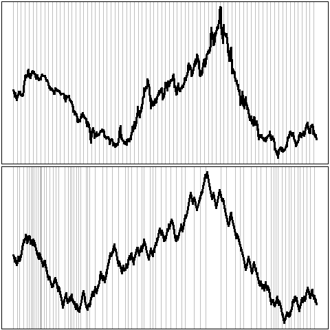
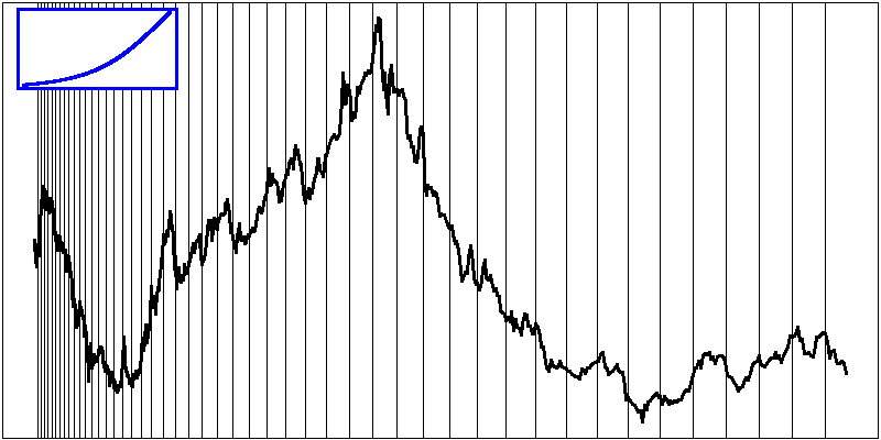
It might seem that the aspect ratio of a plot is irrelevant: this is not the case. For instance, people can more easily compare slopes when they are close to 45 degrees. Choosing the aspect ratio to attain such slopes is called "banking". In the following example, the second plot is therefore preferable to the first.
plot(sunspots, main="No banking", las=1)
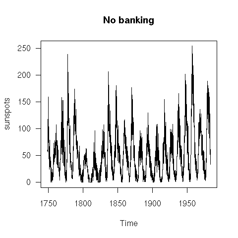
plot(sunspots, main="Banking", las=1)
Weighted least squares can be seen as a standard regression after data transformation: it has a purely geometric interpretation.
# Situation in which you would like to use weighted least squares
N <- 500
x <- runif(N)
y <- 1 - 2 * x + (2 - 1.5 * x) * rnorm(N)
op <- par(mar = c(1,1,3,1))
plot(y ~ x, axes = FALSE,
     main = "Weighted least squares")
box()
for (u in seq(-3,3,by=.5)) {
  segments(0, 1 + 2 * u, 1, -1 + .5 * u,
           col = "blue")
}
abline(1, -2, col = "blue", lwd = 3)
par(op)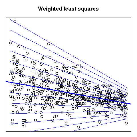
The book briefly mentions maps (these are coordinate transformations), deformed maps and Procrustes rotations (to align a deformed map with the initial map).
http://www.sasi.group.shef.ac.uk/worldmapper/
http://aps.arxiv.org/abs/physics/0401102/
A conformal mapping is a transformation of the plane that preserves angles.
http://mathworld.wolfram.com/ConformalMapping.html
Though they have interesting theoretical properties, they rarely provide intuitive graphics, with one exception: the exponential -- it can be used as a replacement for polar coordinates should you feel the need to preserve angles.
conformal_plot <- function (x, y, ...) {
  # To be used when y is thought to be a periodic function of x,
  # with period 2pi.
  z <- y + 1i * x
  z <- exp(z)
  x <- Re(z)
  y <- Im(z)
  plot(x, y, ...)
}
conformal_abline <- function (h=NULL, v=NULL, a=NULL, b=NULL, ...) {
  if (!is.null(a) | ! is.null(b)) {
    stop("Do not set a or b but only h or v")
  }
  if (!is.null(h)) {
    theta <- seq(0, 2*pi, length=200)
    for (i in 1:length(h)) {
      rho <- exp(h[i])
      lines(rho * cos(theta), rho * sin(theta), type = "l", ...)
    }
  }
  if (!is.null(v)) {
    rho <- sqrt(2) * max(abs(par("usr")))
    segments(0, 0, rho * cos(v), rho * sin(v), ...)
  }
}

op <- par(mar=c(1,1,3,1))
x <- as.vector(sunspots)
conformal_plot(2 * pi * seq(from=0, by=1/(11*12), length=length(x)),
               x / 100,
               type = "l",
               lwd = 2,
               col = "blue",
               xlab = "", ylab = "",
               main = "Sunspots after conformal transformation")
conformal_abline(h=seq(0,3, by=.25), col="grey")
conformal_abline(v = seq(0, 2*pi, length=12), ## 11 years...
                 col = "grey")
par(op)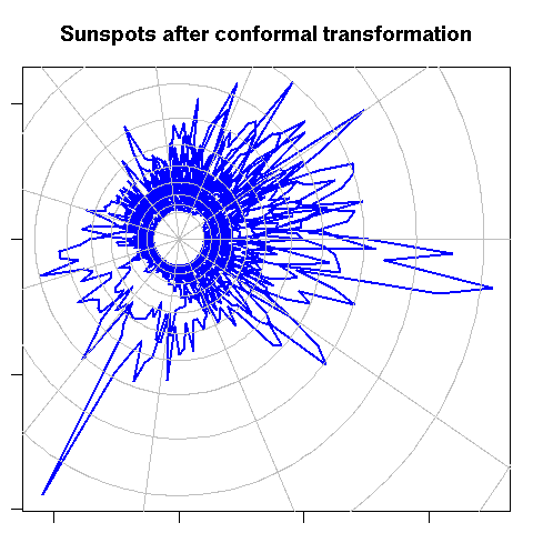
You may wish to zoom on part of the data, to highlight features hidden in a dense cloud of points. Traditional zooming would only display a portion of the data, without any deformation, but you can devise transformations that zoom in on part of the image and out on the rest. In the following example, some text is hidden in the cloud of points: will you be able to read it?
library(pixmap)
z <- read.pnm("2006-08-27_Hello.pgm") # Created (by hand) with The Gimp
z <- z@grey
d <- cbind(
  x = col(z)[ ! z ],
  y = -row(z)[ ! z ]
)
N <- 10000
d <- d[sample(1:nrow(d), N, replace = TRUE),]
d <- d + rnorm(2*N)
#plot(d)
d <- apply(d, 2, scale)
explode <- function (
  d,
  FUN = function (x) { rank(x, na.last="keep") / length(x) }
) {
  # Convert to polar coordinates
  d <- data.frame(
    rho = sqrt(d[,1]^2 + d[,2]^2),
    theta = atan2(d[,2], d[,1])
  )
  d$rho <- FUN(d$rho)
  # Convert back to cartesian coordinates
  d <- cbind(
    x = d$rho * cos(d$theta),
    y = d$rho * sin(d$theta)
  )
  d
}
#plot(explode(d))
d <- explode(d, FUN = function (x) x^4)
d <- apply(d, 2, function (x) (x - min(x))/diff(range(x)))
d <- rbind(d, matrix(rnorm(2*N), nc=2))

# Exercice: Find the word in the following cloud of points...
op <- par(mfrow=c(2,2), mar=c(.1,.1,.1,.1))
plot(d, axes = FALSE)
box()
plot( rank(d[,1]), rank(d[,2]), axes = FALSE )
box()
plot(explode(d), axes = FALSE)
box()
plot(explode(d, atan), axes = FALSE)
box()
par(op)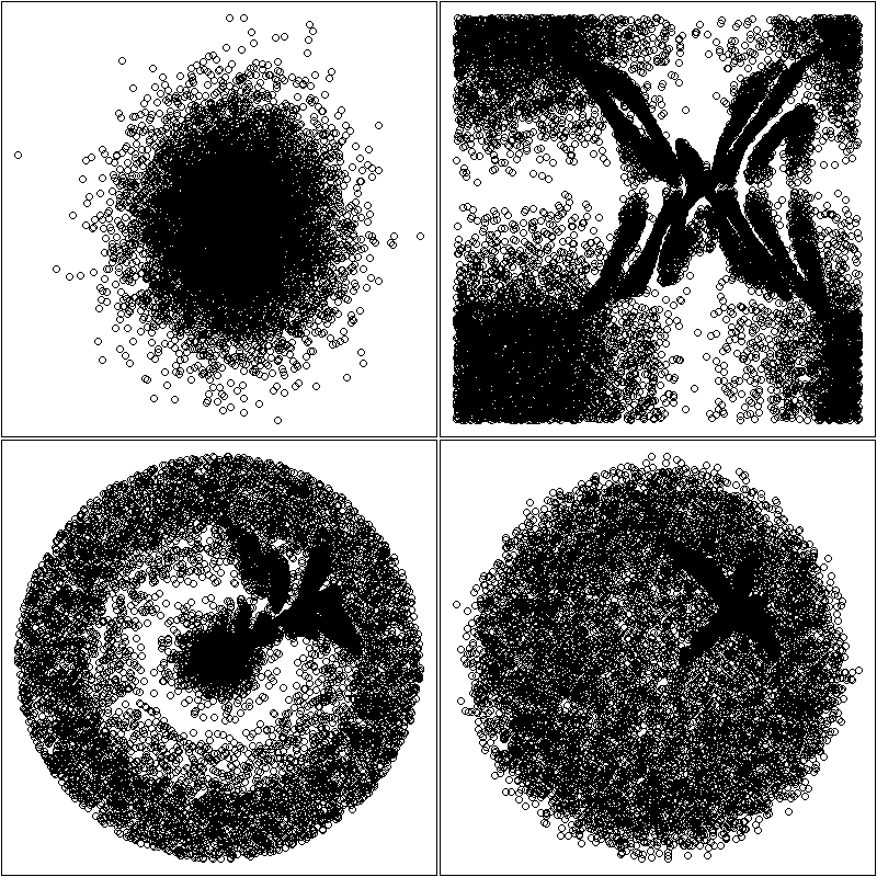
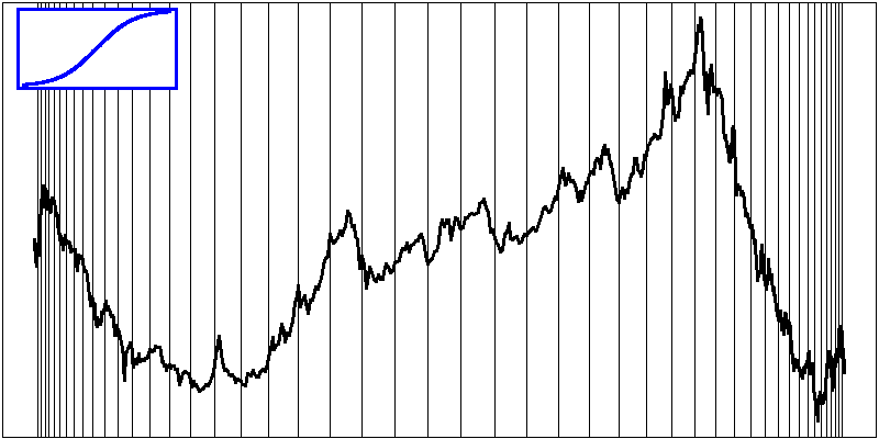
This also works with a single dimension.
one_dimensional_fish_eye <- function (x1, x2, y, method="natural") {
  n <- length(y)
  x <- seq(min(x1), max(x1), length=n)
  x3 <- splinefun(x1, x2, method = method)(x)
  if (! all(x3 == sort(x3))) {
    warning("Non monotonic transformation!")
  }
  d <- cbind(x=x3, y=y)
  op1 <- par(mar=c(.1,.1,.1,.1))
  plot(d, type="l", lwd=3, axes = FALSE)
  box()
  abline(v=d[seq(0,length(y),by=ceiling(length(y)/50)),1])
  op2 <- par(fig=c(.02,.2,.8,.98), mar=c(0,0,0,0), new=TRUE)
  plot(x, x3, type = "l", lwd = 3, axes = FALSE)
  polygon(rep(par("usr")[1:2], 2)[c(1,2,4,3)],
          rep(par("usr")[3:4], each=2),
          border = NA, col = "white")
  lines(x, x3, type = "l", lwd = 3, col="blue")
  box(lwd=3, col="blue")
  par(op2)
  par(op1)
}
library(Ecdat) # Some econometric data
data(DM)
y <- DM$s
# More details in the middle
one_dimensional_fish_eye(
  seq(0, 1, length = 4),
  c(0, .2, .8, 1),
  y
)

# More details on the left
one_dimensional_fish_eye(
  c(0, .33, .67, 1),
  c(0, .6, .9, 1),
  y
)

# More details on the right
one_dimensional_fish_eye(
  seq(0, 1, length=4),
  c(0, .1, .4, 1),
  y
)

The hyperbolic plane (more precisely, the Poincare disc) can also be used to the same effect, especially to display trees (do not use it in the US: even though the idea is one century old, someone managed to patent it...).
http://mathworld.wolfram.com/PoincareHyperbolicDisk.html
http://hypertree.sourceforge.net/
http://www.freepatentsonline.com/6104400.html
(Yes, R can do that -- but I am not convinced of the usefulness of those plots.)
data(iris)
print(cloud(Sepal.Length ~ Petal.Length * Petal.Width,
            data = iris, cex = .8,
            groups = Species,
            subpanel = panel.superpose,
            main = "Stereo",
            screen = list(z = 20, x = -70, y = 3)),
      split = c(1,1,2,1), more = TRUE)
print(cloud(Sepal.Length ~ Petal.Length * Petal.Width,
            data = iris, cex = .8,
            groups = Species,
            subpanel = panel.superpose,
            main = "Stereo",
            screen = list(z = 20, x = -70, y = 0)),
      split = c(2,1,2,1))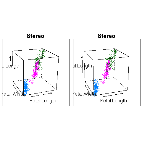
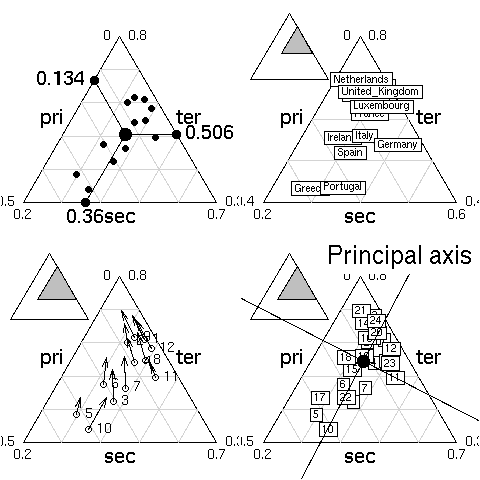
library(ade4)
example(triangle.plot)
When plotting, on a 2-dimensional plane, a high-dimensional data set, you have to somehow reduce its dimension, project it onto a 2-dimensional "subspace".
Principal component analysis (PCA) can do that: it selects the direction in which the cloud of points is largest, projects the cloud of points to the orthogonal supplement of this dimension, and iterates.
Projection Pursuit (PP) is the generalization of PCA: you have to provide the criterion to maximize. With the variance, it yields PCA; with robust analogues of the variance, it yields a robust PCA. You can also try with other measures of risk, if variance is not meaningful for your data set. With a measure of non-gaussianity, it yields Independant Component Analysis (ICA) (used for signal separation). With the correlation with an other vector, it yields partial least squares (PLS).
There are also non-linear ways of projecting a cloud of points onto a 2-dimensional space: multidimensional scaling (MDS) first computes the matrix of distances between all the points in the high-dimensional cloud of points and then tries to find 2-dimensional coordinates that best match those distances (the discrepancy between the high-dimensional distance matrix and the 2-dimensional one is measured by a "stress" function).
There are also local analogues, that only take into account distances between close points, such as isomap.
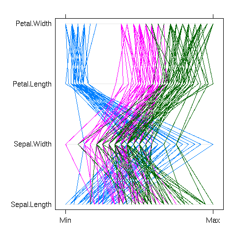
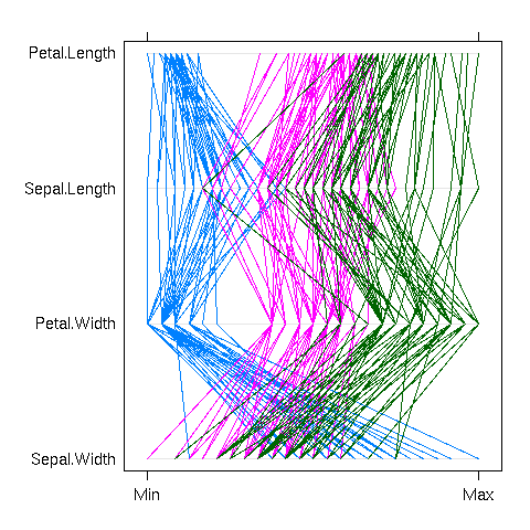
Actually, you do not always need to reduce the dimension of your dataset before plotting it. The parallel plot simply represents each observation as a curve, the i-th coordinate being the y-value of the i-th point of the curve. This can be done in cartesian or polar coordinates.
library(lattice)
parallel(~iris[1:4], groups = Species, iris)
polar_parallel_plot <- function (d, col = par("fg"),
                                 type = "l", lty = 1, ...) {
  d <- as.matrix(d)
  d <- apply(d, 2, function (x) .5 + (x - min(x)) / (max(x) - min(x)))
  theta <- (col(d) - 1) / ncol(d) * 2 * pi
  d <- cbind(d, d[,1])
  theta <- cbind(theta, theta[,1])
  matplot( t(d * cos(theta)),
           t(d * sin(theta)),
           col = col,
           type = type, lty = lty, ...,
           axes = FALSE, xlab = "", ylab = "" )
  segments(rep(0,ncol(theta)), rep(0, ncol(theta)),
           1.5 * cos(theta[1,]), 1.5 * sin(theta[1,]))
  if (! is.null(colnames(d))) {
    text(1.5 * cos(theta[1,-ncol(theta)]),
         1.5 * sin(theta[1,-ncol(theta)]),
         colnames(d)[-ncol(d)])
  }
}
op <- par(mar=c(0,0,0,0))
polar_parallel_plot(iris[1:4], col = as.numeric(iris$Species))
par(op)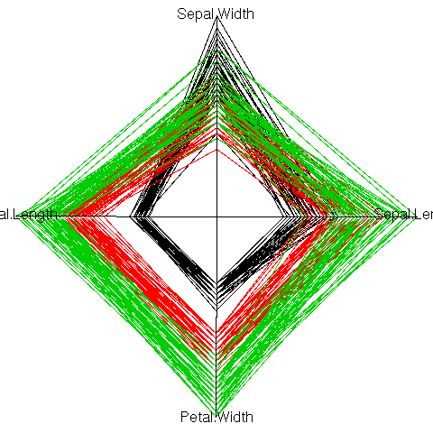
Some care should be taken to choose an order on the coordinates: the parallel plot actually compares each variable with the next. If there are interesting features between variables n and n+2, but nothing striking between n and n+1 and between n+1 and n+2, they will be unnoticed. For instance, in the previous example, one could readily compare the width and length of a petal, or the length and width of a sepal, but not the width of sepals and petals, nor their lengths. The order on the variables should be carefully chosen, either from previous domain knowledge, or from the data.
parallel(~iris[c(2,4,1,3)], groups= Species, iris)
Instead of a parallel plot, you can use a Fourier function, i.e., represent the vector (x1, x2, x3, x4, x5) by the curve of the function
f(t) = x1 + x2 cos(t)  + x3 sin(t)
          + x4 cos(2t) + x5 sin(2t).
The resulting curves are sometimes called "Andrew curves". In polar coordinates, this is called a Fourier blob. As for parallel plots, care should be taken to select a meaningful order on the coordinates.
x <- seq(-pi, pi, length=100)
y <- apply(as.matrix(iris[,1:4]),
           1,
           function (u) u[1] + u[2] * cos(x) +
                               u[3] * sin(x) + u[4] * cos(2*x))
matplot(x, y,
        type = "l",
        lty = 1,
        col = as.numeric(iris[,5]),
        xlab = "", ylab = "",
        main = "Fourier (Andrew) curves")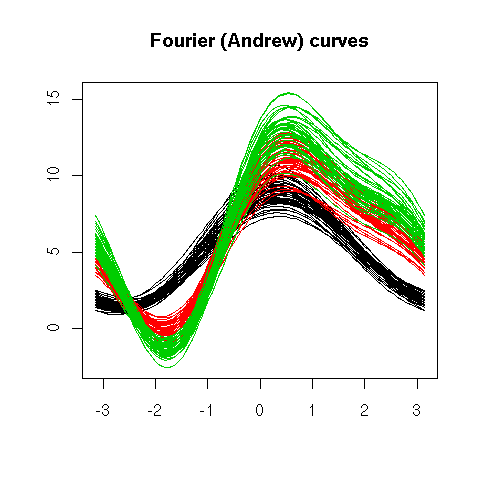
matplot(y * cos(x), y * sin(x),
        type = "l",
        lty = 1,
        col = as.numeric(iris[,5]),
        xlab = "", ylab = "",
        main = "Fourier blob")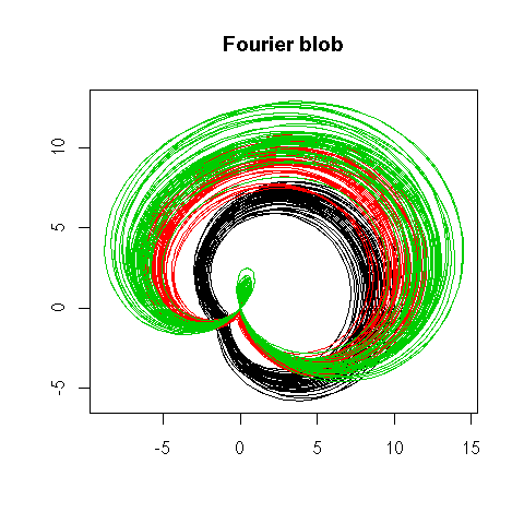
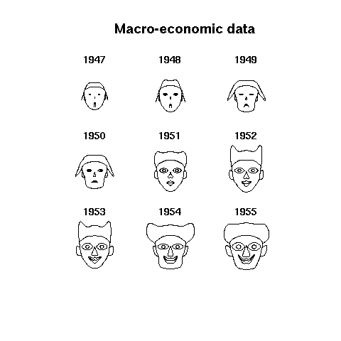
Chernoff faces are a more human alternative to Fourier blobs -- they might look funny and useless, but they are surprisingly efficient for quick decision making.
library(TeachingDemos)
faces(longley[1:9,], main="Macro-economic data")
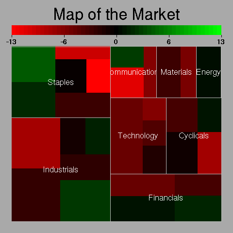
Treemaps are 2-dimensional barplots used to represent hiearchical classifications.
library(portfolio)
example(map.market)
A Region Tree is a set of barplots that progressively drill-down into the data.
olap <- function (x, i) {
  # Project (drill-up?) a data cube
  y <- x <- apply(x, i, sum)
  if (length(i) > 1) {
    y <- as.vector(x)
    n <- dimnames(x)
    m <- n[[1]]
    for (i in (1:length(dim(x)))[-1]) {
      m <- outer(m, n[[i]], paste)
    }
    names(y) <- m
  }
  y
}
col1 <- c("red", "green", "blue", "brown")
col2 <- c("red", "light coral",
          "green", "light green",
          "blue", "light blue",
          "brown", "rosy brown")
col3 <- col2[c(1,2,1,2,3,4,3,4,5,6,5,6,7,8,7,8)]
op <- par(mfrow=c(3,1), mar=c(8,4,0,2), oma=c(0,0,2,0), las=2)
barplot(olap(Titanic,1),   space=0, col=col1)
barplot(olap(Titanic,2:1), space=0, col=col2)
barplot(olap(Titanic,3:1), space=0, col=col3)
par(op)
mtext("Region tree", font = 2, line = 3)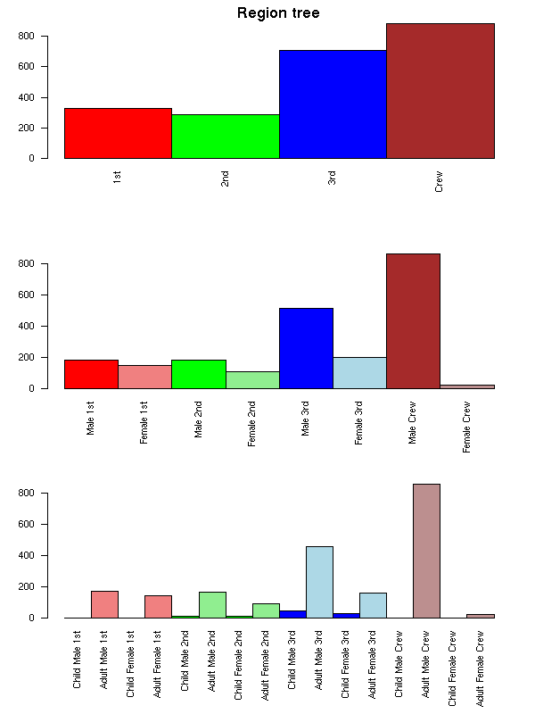
A TempleMVV plot can be seen as those barplots overlaid on one another.
x1 <- olap(Titanic,3:1)
x2 <- rep(olap(Titanic,2:1), each=dim(Titanic)[3])
x3 <- rep(olap(Titanic,1),   each=prod(dim(Titanic)[2:3]))
x4 <- rep(sum(Titanic),      each=prod(dim(Titanic)[1:3]))
op <- par(mar=c(8,4,4,2))
barplot(x4, names.arg="", axes = FALSE, col = "light coral")
barplot(x3, names.arg="", axes = FALSE, col = "light green",  add = TRUE)
barplot(x2, names.arg="", axes = FALSE, col = "light blue",   add = TRUE)
barplot(x1, las=2,        axes = FALSE, col = "yellow", add = TRUE)
mtext("TempleMVV Plot", line=2, font=2, cex=1.2)
par(op)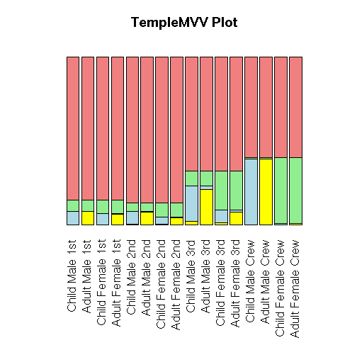
Those plots are designed to study OLAP data (i.e., "data cubes", i.e., correspondance tables with many, many variables).
The traditional way of plotting a bivariate dataset is to use the two variables as coordinates. If both are positive, and if there are few observations, one can also draw the observations as rectangles, whose width and height are given by the two variables.
x <- mtcars[,1:2]
x <- x[sample(1:dim(x)[1],8),]
x <- x[order(x[,1]),]
op <- par(mfrow=c(2,2), mar=c(4,7,3,2))
# Excel plot
barplot(t(as.matrix(x)),
        beside=TRUE, horiz=TRUE, las=1,
        main = "Excel plot")
#barchart(as.matrix(x), stack=F)
# Dotplot
#dotplot(as.matrix(x))
dotchart(as.matrix(x), main = "dotplot")
# Sized bars
barplot(x[,1],
        names.arg = rownames(x),
        width = x[,2],
        horiz = TRUE, las = 2,
        main = "Sized bars")
# Scatterplot
par(mar=c(4,4,4,2))
plot(x, main = "Scatterplot")
text(x, rownames(x), adj=c(1,0))
par(op)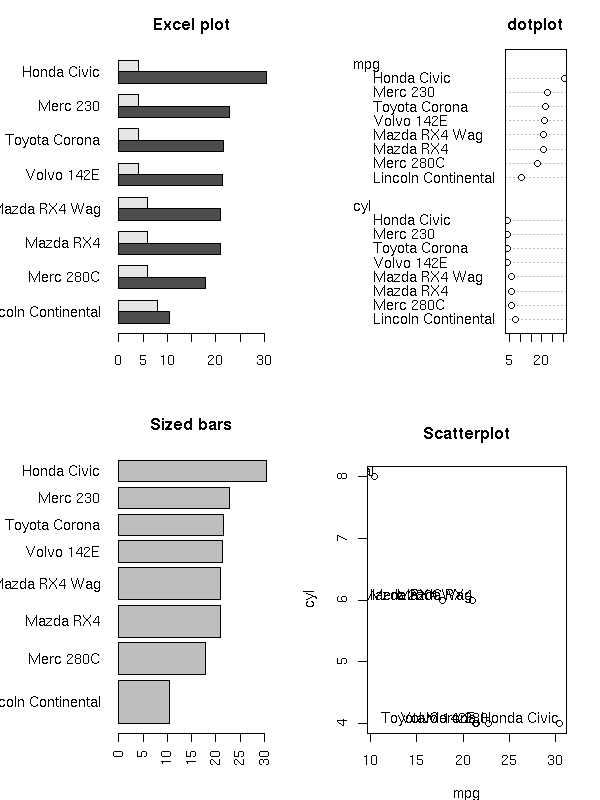
This can be generalized: with three quantitative variables, you can use the first two as coordinates and the third as the size of the plotting symbols (bubble plot); with four variables, you can use two variables for the coordinates and the remaining two for the width and the height of the plotting symbol (say, a rectangle); with more variables, you can use the first two as coordinates and the remaining ones for the lengths of the spokes of a star (star plot) -- instead of a star, you can use, say, a Fourier blob.
Scatterplot matrices or lattice plots can be generalized: e.g., the plots can be arranged into a circle (a lattice plot whose cells are drawn in polar coordinates), a tree, a graph, etc.
http://addictedtor.free.fr/graphiques/RGraphGallery.php?graph=84
Mosaic plots and linked micromaps can also be seen as facet plots.
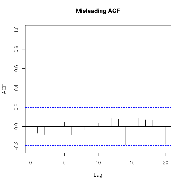
It is often useful to add guides, such as the y=0 line, but too many of them can be misleading: for instance, when plotting an autocorrelation function, the zero autocorrelation is not useful to plot -- indeed, it could mislead the reader into thinking that the autocorrelation has a well-defined sign when it is not even significantly non-zero. The 5% confidence interval lines are more useful, though.
x <- rnorm(100)
acf(x, main = "Misleading ACF?")
r <- acf(x, plot = FALSE)
plot(r$lag, r$acf,
     type = "h", lwd = 20, col = "grey",
     xlab = "lag", ylab = "autocorrelation",
     main = "Autocorrelation without the y=0 line")
ci <- .95
clim <- qnorm( (1+ci) / 2 ) / sqrt(r$n.used)
abline(h = c(-1,1) * clim,
       lty = 2, col = "blue", lwd = 2)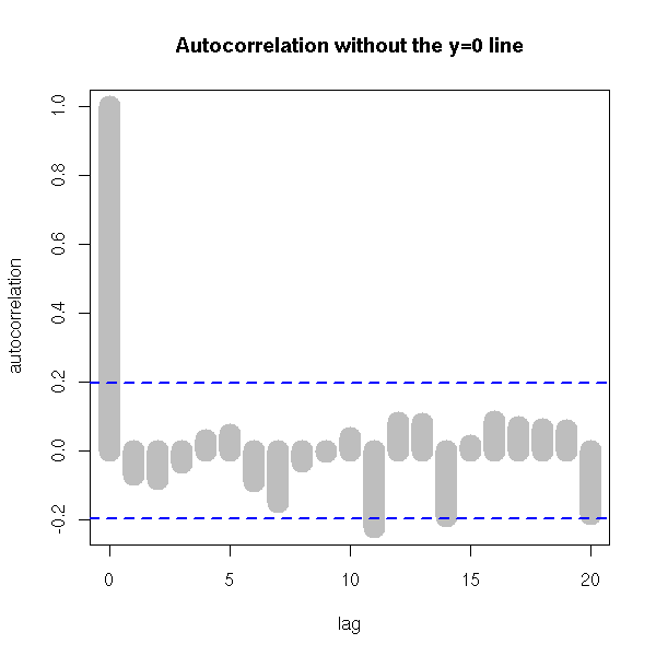
Annotations also include names ("labels") of selected points (if there are many, you may have to resort to optimization algorithms such as simulated annealing to automatically place them), titles, axis names -- the title can even be supplemented by an image).
Plotting a spacial process (this could actually be any 2-dimensional process, regardless of the interpretation of those two dimensions) does not always give enough insight. To improve this plot, one can "decorate" it with various graphs. The most useful is probably the minimum spanning tree (MST): if there is a functional relation between the two variables, or of the points tend to lie on a 1-dimensional subspace, this will become obvious -- even more so if you consider a pruned MST.
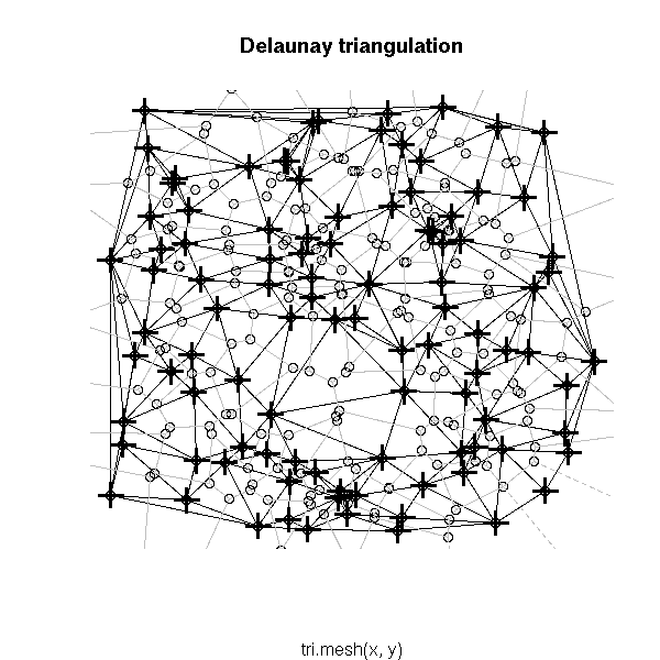
Other potentiall useful decorations include: a minimum length path (this is the traveling salesman problem (TSP)), the nearest neighbour graph (each point is connected to the closest -- this is actually a subgraph of the MST), the convex hull, the alpha hull, the Voronoi mosaic, the Delaunay triangulation, etc.
x <- runif(100)
y <- runif(100)
nearest_neighbour <- function (x, y, d=dist(cbind(x,y)), ...) {
  n <- length(x)
  stopifnot(length(x) == length(y))
  d <- as.matrix(d)
  stopifnot( dim(d)[1] == dim(d)[2] )
  stopifnot( length(x) == dim(d)[1] )
  i <- 1:n
  j <- apply(d, 2, function (a) order(a)[2])
  segments(x[i], y[i], x[j], y[j], ...)
}
plot(x, y,
     main="Nearest neighbour graph",
     xlab = "", ylab = "")
nearest_neighbour(x, y)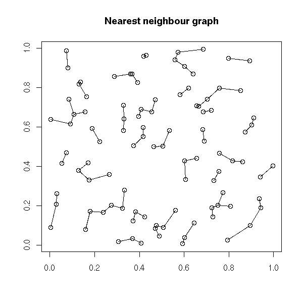
plot(x, y,
     main = "Minimum spanning tree",
     xlab = "", ylab = "")
nearest_neighbour(x, y, lwd=10, col="grey")
points(x,y)
library(ape)
r <- mst(dist(cbind(x, y)))
i <- which(r==1, arr.ind=TRUE )
segments(x[i[,1]], y[i[,1]], x[i[,2]], y[i[,2]],
         lwd = 2, col = "blue")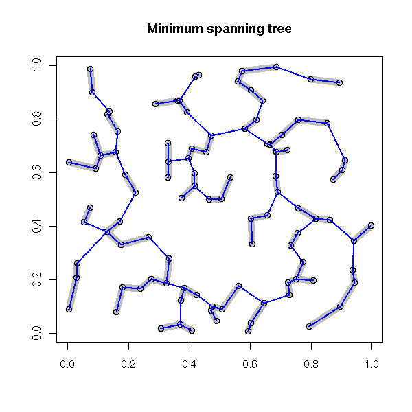
# Voronoi diagram
library(tripack)
plot(voronoi.mosaic(x, y))
segments(x[i[,1]], y[i[,1]], x[i[,2]], y[i[,2]],
         lwd=3, col="grey")
points(x, y, pch=3, cex=2, lwd=3)
box()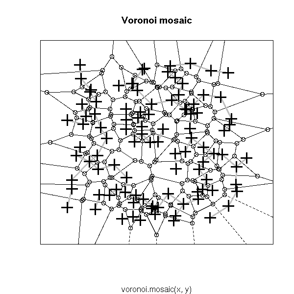
# Delaunay triangulation
# See also the "deldir" package
plot(tri.mesh(x,y))
plot(voronoi.mosaic(x, y), add=T, col="grey")
points(x, y, pch=3, cex=2, lwd=3)
The phase plane plot of a time series (or, more generally, a dynamical system) is the plot of dx/dt versus x. If you use the time to select the colour of the points, this can highlight a regime change.
phase_plane_plot <- function (
  x,
  col=rainbow(length(x)-1),
  xlab = "x", ylab = "dx/dt",
  ...) {
  plot( x[-1], diff(x), col = col,
        xlab = xlab, ylab = ylab, ... )
}
phase_plane_plot( sin(seq(0, 20*pi, length=200)), pch=16 )

x <- c(sin(seq(0, 5*pi, length=500)),
       sin(seq(0, 5*pi, length=1000)) + .2*rnorm(1000),
       sin(seq(0, 2*pi, length=500)^2))
phase_plane_plot(x)

library(tseriesChaos)
phase_plane_plot(lorenz.ts, pch=16,
                 main = "Phase plot")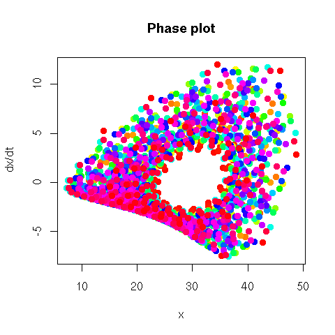
phase_plane_plot(lorenz.ts, type="l",
                 main = "Phase plot")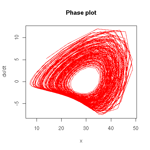
The book also mentions Poincare sections.
http://mathworld.wolfram.com/SurfaceofSection.html
http://www.maplesoft.com/applications/app_center_view.aspx?AID=5&CID=1&SCID=3
http://images.google.co.uk/images?q=poincare%20section
The recurrence plot of a time series plots the distance between x(t1) and x(t2) as a function of t1 and t2.
recurrence_plot <- function (x, ...) {
  image(outer(x, x, function (a, b) abs(a-b)), ...)
  box()
}
N <- 500
recurrence_plot( sin(seq(0, 10*pi, length=N)),
                 main = "Recurrence plot: sine")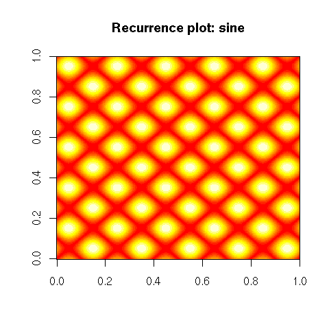
recurrence_plot( rnorm(100),
                 main = "Recurrence plot: noise" )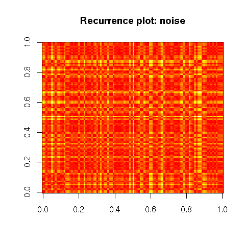
recurrence_plot( cumsum(rnorm(200)),
                 main = "Recurrence plot: random walk")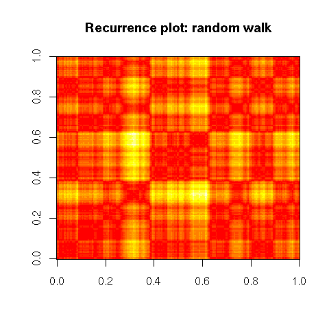
library(tseriesChaos)
recurrence_plot(lorenz.ts[100:200],
                main = "Recurrence plot: Lorentz attractor")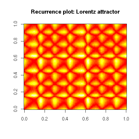
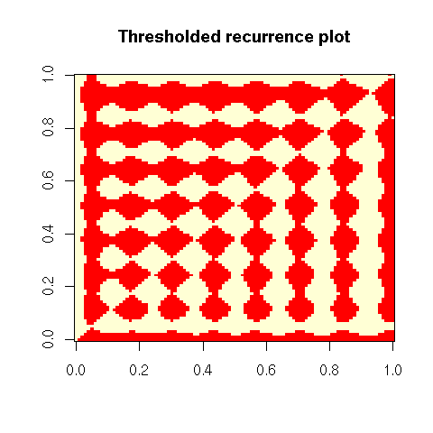
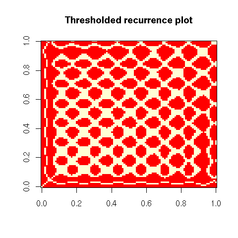
# Thresholded recurrence plot
thresholded_recurrence_plot <- function (
  x,
  threshold = 0,
  FUN = function (x) x,
  ...
) {
  image(-outer(
      x, x,
      function (a, b)
        ifelse(FUN(a-b)>threshold,1,0)
    ),
    ...)
  box()
}
thresholded_recurrence_plot(
  lorenz.ts[1:100],
  0,
  main = "Thresholded recurrence plot"
)
thresholded_recurrence_plot(
  lorenz.ts[1:100],
  5,
  abs,
  main = "Thresholded recurrence plot"
)
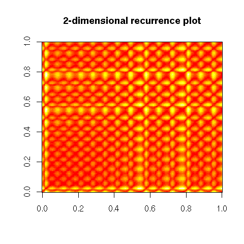
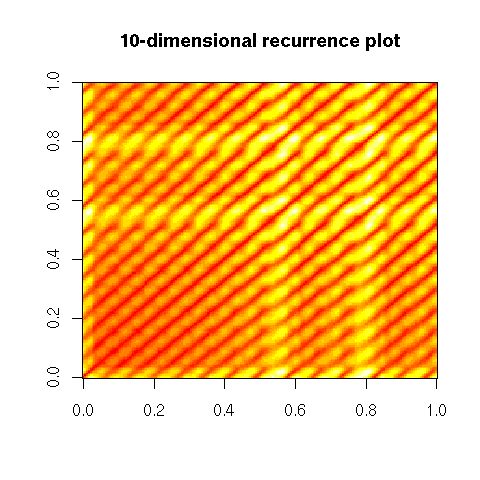
This is the "1-dimensional recurrence plot": instead of taking the distance between x(t1) and x(t2), one can compute the distance between the m-dimensional vectors (x(t1),x(t1+1),...,x(t1+m-1)) and (x(t2),x(t2+1),...,x(t2+m-1)).
# Recurrence plot
recurrence_plot <- function (x, m, ...) {
  stopifnot (m >= 1, m == floor(m))
  res <- outer(x, x, function (a,b) (a-b)^2)
  i <- 2
  LAG <- function (x, lag) {
    stopifnot(lag > 0)
    if (lag >= length(x)) {
      rep(NA, length(x))
    } else {
      c(rep(NA, lag), x[1:(length(x)-lag)])
    }
  }
  while (i <= m) {
    res <- res + outer(LAG(x,i-1), LAG(x,i-1), function (a,b) (a-b)^2)
    i <- i + 1
  }
  res <- sqrt(res)
  if (m>1) {
    res <- res[ - (1:(m-1)), ] [ , - (1:(m-1)) ]
  }
  image(res, ...)
  box()
}
library(tseriesChaos)
recurrence_plot(lorenz.ts[1:200], m=1,
                main = "1-dimensional recurrence plot")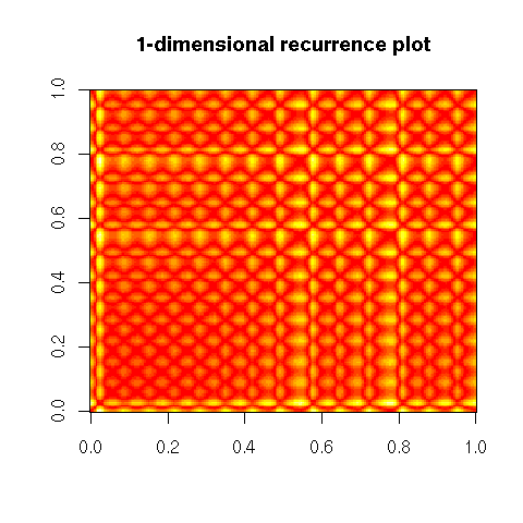
recurrence_plot(lorenz.ts[1:200], m=2)
recurrence_plot(lorenz.ts[1:200], m=10)
# A more complete function
recurrence_plot <- function (
  x,
  m=1,           # Dimension of the embedding
  t=1,           # Lag used to define this embedding
  epsilon=NULL,  # If non-NULL, threshold
  box=TRUE, ...
) {
  stopifnot( length(m) == 1, m >= 1, m == floor(m),
             length(t) == 1, t >= 1, t == floor(t),
             is.null(epsilon) || (
               length(epsilon) == 1 && epsilon > 0 ) )
  stopifnot( length(x) > m * t )
  res <- outer(x, x, function (a,b) (a-b)^2)
  i <- 2
  LAG <- function (x, lag) {
    stopifnot(lag > 0)
    if (lag >= length(x)) {
      rep(NA, length(x))
    } else {
      c(rep(NA, lag), x[1:(length(x)-lag)])
    }
  }
  while (i <= m) {
    y <- LAG(x,t*(i-1))
    res <- res + outer(y, y, function (a,b) (a-b)^2)
    i <- i + 1
  }
  res <- sqrt(res)
  if (!is.null(epsilon)) {
    res <- res > epsilon
  }
  if (m>1) {
    # TODO: Check this...
    res <- res[ - (1:(t*(m-1))), ] [ , - (1:(t*(m-1))) ]
  }
  image(res, ...)
  if (box) {
    box()
  }
}
library(tseriesChaos)
recurrence_plot(lorenz.ts[1:200], m=10)
title("Recurrence plot")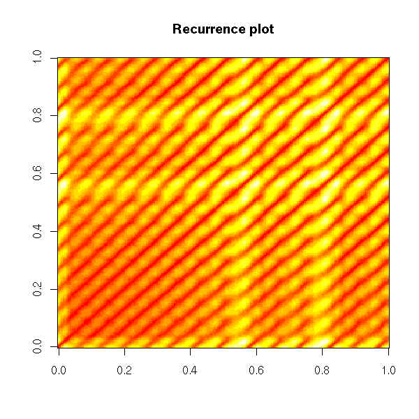
op <- par(mfrow=c(5,5), mar=c(0,0,0,0), oma=c(0,0,2,0))
for (i in 1:5) {
  for (j in 1:5) {
    recurrence_plot(lorenz.ts[1:200], m=i, t=j,
                    axes=FALSE)
  }
}
par(op)
mtext("Recurrence plots", line=3, font=2, cex=1.2)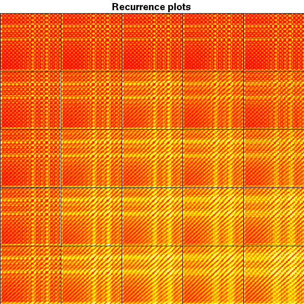
For more about recurrence plots, check
http://www.recurrence-plot.tk/
Uncertainty can be represented by blurred areas, e.g., a blurred barplot -- but I am not convinced it is a good idea...
The Tukey plot (also called the "Hsu-Peruggia mean-mean scatterplot") can be used to simultaneously display several confidence intervals (think: "confidence intervals on the mean equity returns in several countries") and the corresponding pairwise tests, accounting for the multiple comparisons.
For more details (and pictures), check R.M. Heiberger and B. Holland, Statistical Analysis and data display, chapter 7.
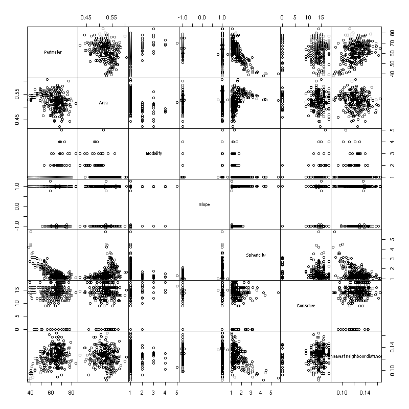
Scaptterplots (and matrices of scatterplots) help you spot outliers, data anomalies, but also implications between variables (triangle-shaped plots).
When there are too many dimensions to even think of a scatterplot matrix (splom), you can board for a "Grand Tour", i.e., a continuous family of 2-dimensional projections of the cloud of points, that displays the data from a variety of points of view. It may sound surprising, but the Grand Tour allows you to visualize, to spacialize a cloud of points in up to six dimensions. Give it a try: check the videos on the Ggobi website and/or use ggobi with your own data.
http://ggobi.org/demos/
When a scatterplot matrix (splom) is too large, you can just plot a (selected) part of it. But how to select "interesting" pairs of variables?
One idea is to consider several measures of "interestingness", of peculiarity of scatterplots: for instance, whether the plot is circular, whether there is a clear relation between the variables, whether this relation is monotonic, whether this relation is linear, etc. Those measures are called "scagnostics" -- scatterplot diagnostics. One can then look at the scatterplot of those scagnostics: the variables are those scagnostics and the observations are the pairs of initial variables, i.e., the cells in the initial (overly large) splom.
Here are some classical scagnostics: area of closed 2-dimensional density contours, perimeter of those contours, convexity of those contours, number of connected components of those contours (multimodality), non-linearity of the principal curves, average nearest-neighbour distance, etc.
uniformize <- function (x) {
  x <- rank(x, na.last="keep")
  x <- (x - min(x, na.rm=TRUE)) / diff(range(x, na.rm=TRUE))
  x
}
scagnostic_contour <- function (x, y, ..., FUN = median) {
  x <- uniformize(x)
  y <- uniformize(y)
  require(MASS) # For kde2d()
  r <- kde2d(x, y, ...)
  r$z > FUN(r$z)
}
translate <- function (x,i,j,zero=0) {
  n <- dim(x)[1]
  m <- dim(x)[2]
  while (i>0) {
    x <- rbind( rep(zero,m), x[-n,] )
    i <- i - 1
  }
  while (i<0) {
    x <- rbind( x[-1,], rep(zero,m) )
    i <- i + 1
  }
  while (j>0) {
    x <- cbind( rep(zero,n), x[,-m] )
    j <- j - 1
  }
  while (j<0) {
    x <- cbind( x[,-1], rep(zero,n) )
    j <- j + 1
  }
  x
}
scagnostic_perimeter <- function (x, y, ...) {
  z <- scagnostic_contour(x, y, ...)
  zz <- z |
        translate(z,1,0)  | translate(z,0,1)  |
        translate(z,-1,0) | translate(z,0,-1)
  sum(zz & ! z)
}
scagnostic_area <- function (x, y, ...) {
  z <- scagnostic_contour(x, y, ..., FUN = mean)
  sum(z) / length(z)
}
connected_components <- function (x) {
  stopifnot(is.matrix(x), is.logical(x))
  m <- dim(x)[1]
  n <- dim(x)[2]
  x <- rbind( rep(FALSE, n+2),
              cbind( rep(FALSE, m), x, rep(FALSE, m) ),
              rep(FALSE, n+2))
  x[ is.na(x) ] <- FALSE
  # Assign a label to each pixel, so that pixels with the same
  # label be in the same connected component -- but pixels in the
  # same connected component may have different labels.
  current_label <- 0
  result <- ifelse(x, 0, 0)
  equivalences <- list()
  for (i in 1 + 1:m) {
    for (j in 1 + 1:n) {
      if (x[i,j]) {
        number_of_neighbours <- x[i-1,j-1] + x[i-1,j] + x[i-1,j+1] + x[i,j-1]
        labels <- c( result[i-1,j-1], result[i-1,j],
                     result[i-1,j+1], result[i,j-1] )
        labels <- unique(labels[ labels > 0 ])
        neighbour_label <- max(0,labels)
        if (number_of_neighbours == 0) {
          current_label <- current_label + 1
          result[i,j] <- current_label
        } else if (length(labels) == 1) {
          result[i,j] <- neighbour_label
        } else {
          result[i,j] <- neighbour_label
          equivalences <- append(equivalences, list(labels))
        }
      }
    }
  }
  # Build the matrix containing the equivalences between those labels
  # We just have the matrix of a (non-equivalence) relation: we compute
  # the equivalence relation it generates.
  E <- matrix(FALSE, nr=current_label, nc=current_label)
  for (e in equivalences) {
    stopifnot( length(e) > 1 )
    for (i in e) {
      for (j in e) {
        if (i != j) {
          E[i,j] <- TRUE
        }
      }
    }
  }
  E <- E | t(E)
  diag(E) <- TRUE
  for (k in 1:current_label) {
    E <- E | (E %*% E > 0)
  }
  stopifnot( E == E | (E %*% E > 0) )
  # Find the equivalence classes, i.e., the unique rows of this matrix
  E <- apply(E, 2, function (x) min(which(x)))
  # Finally, label the equivalence classes
  for (i in 1:current_label) {
    result[ result == i ] <- E[i]
  }
  result
}
connected_components_TEST <- function () {
  n <- 100
  x <- matrix(NA, nr=n, nc=n)
  x <- abs(col(x) - (n/3)) < n/8 & abs(row(x) - n/3) < n/8
  x <- x | ( (col(x) - 2*n/3)^2 + (row(x) - 2*n/3)^2 < (n/8)^2 )
  image(!x)
  image(-connected_components(x))
}
scagnostic_modality <- function (x, y, ...) {
  z <- scagnostic_contour(x, y, ...)
  z <- connected_components(z)
  max(z)
}
scagnostic_slope <- function (x,y) {
  x <- uniformize(x)
  y <- uniformize(y)
  pc1 <- prcomp(cbind(x,y))$rotation[,1]
  pc1[2] / pc1[1]
}
scagnostic_sphericity <- function (x,y) {
  x <- uniformize(x)
  y <- uniformize(y)
  # Ratio of the eigenvalues of the PCA
  # For a spherical cloud of points, the slope
  # is not well defined, but this ratio is close to 1.
  ev <- prcomp(cbind(x,y))$sdev
  ev[1] / ev[2]
}
scagnostic_curvature <- function (x,y) {
  x <- uniformize(x)
  y <- uniformize(y)
  require(pcurve)
  # BUG: pcurve() starts a new plot by fiddling with par() --
  # it also fails to set it back to what it was...
  par <- function (...) { }
  r <- NULL
  try(
  r <- pcurve(cbind(x,y),
              start = "pca", # Defaults to CA,
                             # which only works with count data...
              plot.pca = FALSE,
              plot.true = FALSE,
              plot.init = FALSE,
              plot.segs = FALSE,
              plot.resp = FALSE,
              plot.cov = FALSE,
              use.loc = FALSE)
  )
  if (is.null(r)) return(0)
  X <- r$s[,1:2]               # The principal curve
  n <- dim(X)[1]
  V <- X[2:n,] - X[1:(n-1),]
  V <- V / sqrt(V[,1]^2 + V[,2]^2) # The direction of the principal
                                   # curve, at each point on it
  C <- apply( V[1:(n-2),] * V[2:(n-1),], 1, sum )
  C <- acos(C)                 # The angles
  sum(abs(C)) / pi
}
scagnostic_distance <- function (x,y) {
  i <- is.finite(x) & is.finite(y)
  if (length(i) < 2) {
    return(NA)
  }
  x <- uniformize(x)[i]
  y <- uniformize(y)[i]
  d <- as.matrix(dist(cbind(x,y)))
  diag(d) <- Inf
  d <- apply(d, 2, min)   # Nearest neighbour distance
  mean(d)
}
scagnostics <- function (
  x,
  functions = list(
    Perimeter  = scagnostic_perimeter,
    Area       = scagnostic_area,
    Modality   = scagnostic_modality,
    Slope      = scagnostic_slope,
    Sphericity = scagnostic_sphericity,
    Curvature  = scagnostic_curvature,
    "Nearest neighbour distance" = scagnostic_distance
  )
) {
  stopifnot( is.matrix(x) || is.data.frame(x) )
  number_of_variables   <- dim(x)[2]
  number_of_scagnostics <- length(functions)
  res <- array(NA, dim=c(number_of_variables,
                         number_of_variables,
                         number_of_scagnostics))
  dimnames(res) <- list(
    Variable1 = colnames(x),
    Variable2 = colnames(x),
    Scagnostic = names(functions)
  )
  for (i in 1:number_of_variables) {
    for (j in 1:number_of_variables) {
      if (i != j) {
        for (k in 1:number_of_scagnostics) {
          res[i,j,k] <- functions[[k]] (x[,i], x[,j])
        }
      }
    }
  }
  class(res) <- "scagnostics"
  res
}
plot.scagnostics <- function (x, FUN=pairs, ...) {
  stopifnot(inherits(x, "scagnostics"))
  y <- apply(x, 3, as.vector)
  colnames(y) <- dimnames(x)[[3]]
  rownames(y) <- outer(dimnames(x)[[1]], dimnames(x)[[2]], paste, sep="-")
  FUN(y, ...)
}

pairs(USJudgeRatings, gap=0)
plot(scagnostics(USJudgeRatings), gap=0)

x <- Harman74.cor[[1]]
pairs(x, gap=0)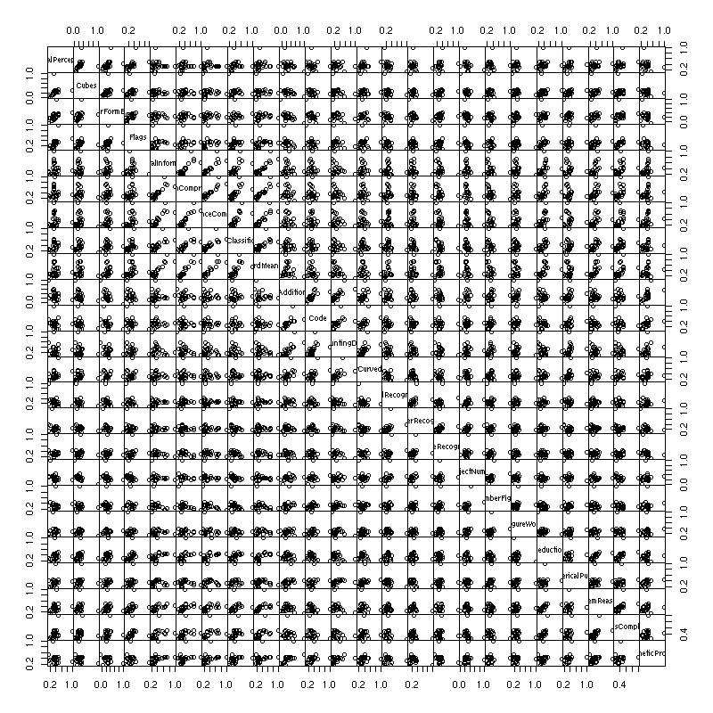
plot(scagnostics(x), gap=0)
Scagnostics are most useful in an interactive environment: one would have the traditionnal scatterplot matrix and the scagnostics scatterplot matrix; one could select cells in the traditional scatterplot and see where they are in the scagnostics scatterplot matrix; one could select ("brush") sets of pairs of variables in the scagnostics scatterplot matrix and have the corresponding cells in the traditional scatterplot matrix immediately highlighted. Sadly, R does not provide such a high level of interactivity yet -- but keep an eye on iPlot.
http://rosuda.org/iPlots/iplots.html
One can also define graph-theoretic scagnostics (i.e., using the minimum spanning tree, the convex hull, the alpha hull, etc., instead of the density estimation).
Graph-theoretic scagnostics, Wilkinson et al. (2005)
http://infovis.uni-konstanz.de/members/bustos/sva_ss06/papers/wilkinso.pdf
Objects of interest for a statistician are not only numbers or vectors: they can be graphs, trees, relations (as in "relational databases"), sequences (DNA, proteins), etc. that call for different plots. The book gives a few simple ideas to plot graphs, such as: convert it to a directed acyclic graph, perform a topological sort, and plot it as if it were a tree.
When studying a cloud of points, one of the first things you are interested in is its "center". What does that notion becomes when you study a graph? A critical path of a directed acyclic graph is a shortest path between two vertices. Think of a workflow, for some project, depicted as a graph: the shortest path between the start and the end of the project contains the critical tasks, those that can delay the project; the tasks off the critical path can be run in parallel, we will not have to wait for them. In a Gantt chart, the elements of the critical path are non-overlaping tasks that have to be carried out in this order.
When dealing with a large number of numeric variables, one could be tempted to consider the dataset as a table of numbers and plot it, as an image. It is not that insightful, because the order on the variables and the observations is likely to be random.
image(t(as.matrix(USJudgeRatings)))
Can we select a meaningful order on the variables and the observations to highlight patterns in the data? Most people advocate a hierarchical clustering on the rows and columns, but it does not appear to be the most efficient method: most of the time, principal component analysis (PCA) or multidimensional scaling (MDS) (or its variants: isomap, LPP, etc.) yield slightly better results.
# This uses cluster analysis
heatmap(as.matrix(USJudgeRatings))
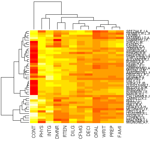
These methods are useful when you need to choose an order on the variables and/or on the observations and no such order is available a priori (for instance, it could be a time or space ordering): e.g., to plot a correlation matrix or for a parallel plot.
posted at: 19:18 | path: /R | permanent link to this entry
